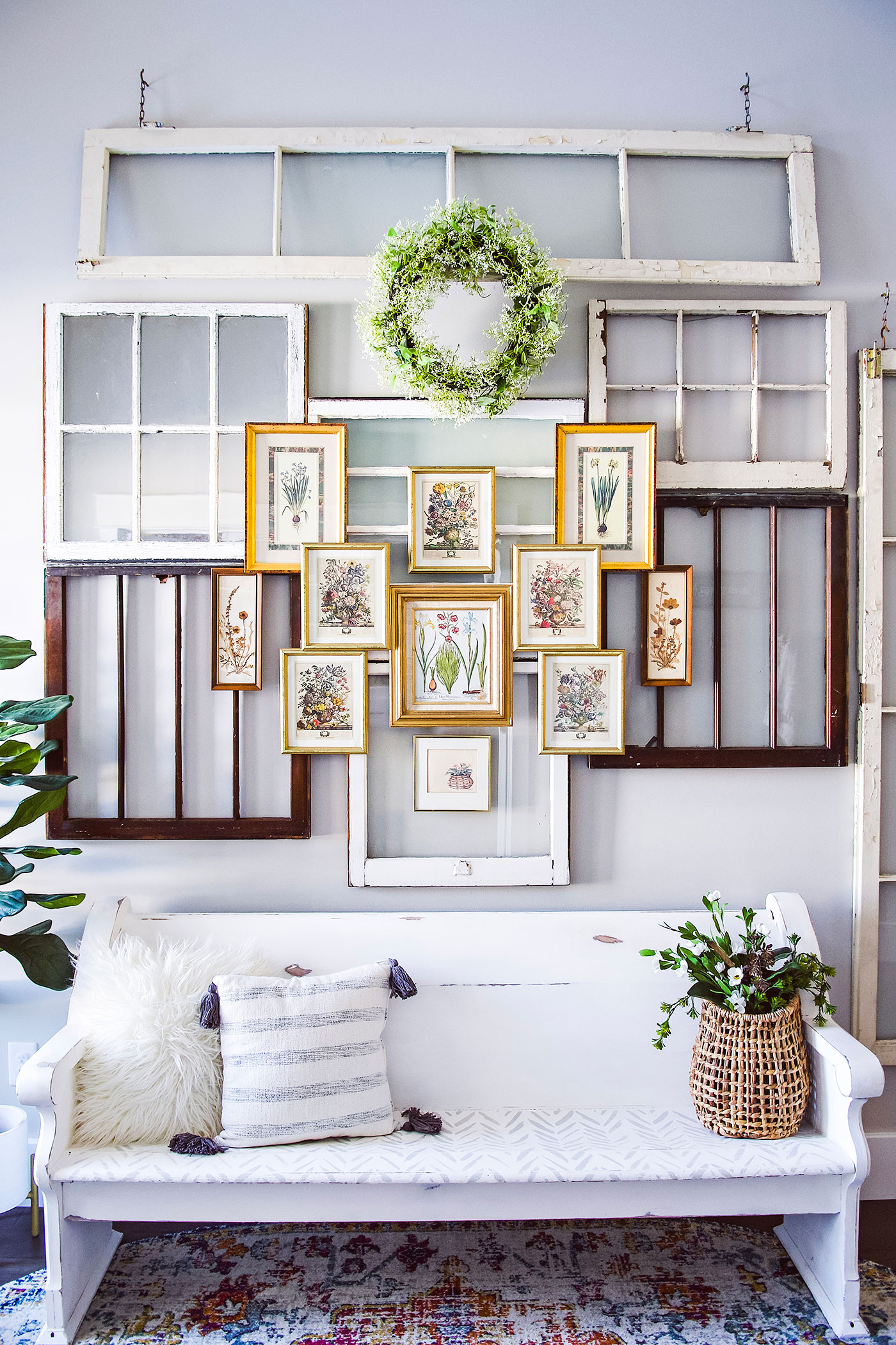
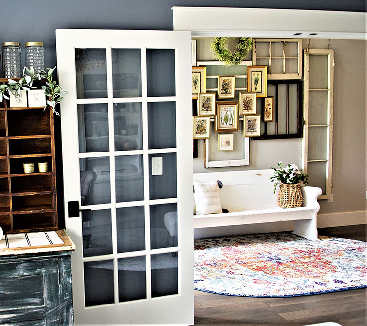
Your entryway is the first impression your guests will have of your home, so it’s important that it reflects your style with a welcoming vibe. We interviewed designer Kera Jeffers of Haute House Love to get the scoop on how she updated her entryway into this beautiful space with a layered window wall.
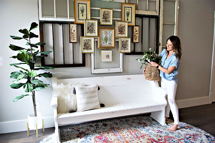
“I would describe my entryway’s style as vintage modern,” says Kera. “When I was designing our home, I wanted a lot of the basics to be very clean lined and black and white, but as I began adding décor to the spaces, I discovered my love for flea markets, thrift shops and the thrill of the hunt. I didn’t want my home to look like anyone else’s, and my entry was the first décor project that truly felt like a reflection of my personal style.”
Truly Inspired
Kera’s inspiration for this layered window wall began with some windows she had leftover from a project in her old house. She knew she wanted to repurpose them in a new way, but it took some help from Instagram to get the ball rolling. “I had started following Erin from @cottonstem, and she had just added vintage frames to a headboard window wall,” Kera says. “The layering effect inspired me, and I knew I wanted to do something similar but make it my own with more texture.”
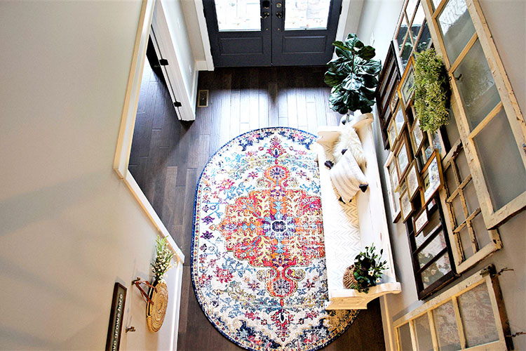
The challenge was making the design work for her two-story entryway. “One day I was out thrifting with my mom, and I found a set of old glass French doors,” says Kera. “It was the “ah-ha” moment that I needed to start bringing the design to life. That same day I was ironically able to hunt down several more windows and vintage frames from the same store! It came together so naturally and just felt like it was meant to be.”
It takes some prep work to design and assemble a gallery wall to ensure minimal damage and rearranging. Here are the steps Kera took to get things right the first time.
Step 1: Draw Your Design
Get a general sense for how you want to arrange your pieces by physically drawing it on paper first. “In the drawing, I’ll start with the large pieces then add in the smaller pieces and any accessories I think it needs (rug, pillows, greenery etc.).”
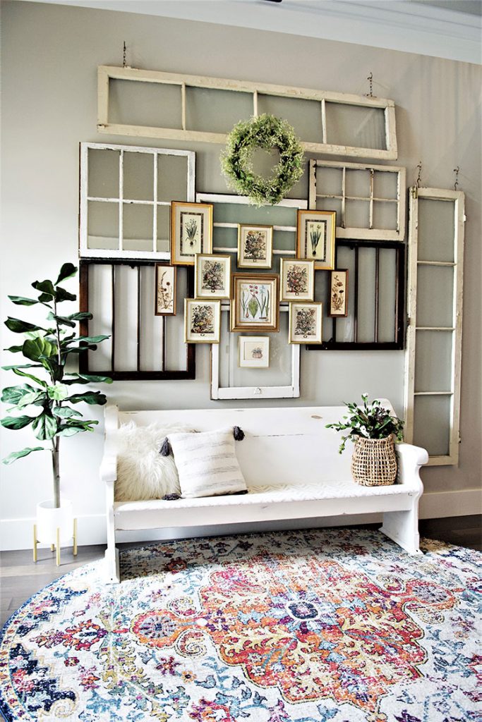
Step 2: Check Your Work
Before your design goes on the wall, make sure it will work by laying it out on the floor. “I lay the large items out on the floor and shift things around until I’m happy with the placement,” says Kera. “During this time, I’ll measure my wall to make sure the dimensions I have laid out on the floor will transfer to the wall.”
Step 3: Work Your Way Out
Once you’ve double checked your work, you can start hanging. “When I’m ready to install, I’ll start with the middle piece then build everything else around it,” Kera says. “Once all of the large pieces were in place, I did the same drawing/floor layout with the vintage prints. I finished with accessories.”
Creativity With a Twist
If you’re looking to create an eye-catching statement in your entryway, Kera suggests getting inspired by others but finding a way to make the idea your own. She also recommends asking for help. “If you are wanting to create a space that is specifically vintage inspired, don’t be afraid to tell people what you are looking for,” says Kera. “I was so surprised the day I told my followers I was looking for a church pew. I was specific with my measurements and budget, and someone was able to come through for me! You never know what people have access to and something as simple as asking may make your thrifting dreams come true.”
For more on Kera’s style, or to connect with her for a design consult, visit her website or follow her on Instagram.
Want to create a vintage gallery wall? Click here for inspiration! And don’t forget to follow our Facebook, Instagram, and Pinterest for some fresh flea market inspiration!


